Sorry it’s been a while! It was hard to find the time to work on LEWD much in November. Really, I’ve been used to largely taking November, December, and the first half of January off work for the past 6 years or so. I work a lot the rest of the year and just want to play games I missed and such around the holidays. This update took me twice the the two weeks I figured it would, and I’m not sure I’ll get a whole lot done in December, either, but I’ll still be chipping away here and there.
The writer remaining on the team is still adding content as well. About 40,000 words of new content has been added to the test server the past 3 months. Not a ton, but hopefully we’ll get another writer or two joining soon, as that’s our main limiting factor with improving the game quickly
Anyway, I decided it’d be best to take some time to improve the dev tools to further make it easier to add content to LEWD.
Above all, that was probably the main goal I had with LEWD: to make it easy to add and manage millions of words of content, and to make it easy to explore all that content in game.
Lots of these games, well either the way you explore content in the game makes it become a mess and too bloated when more than a few hundred thousand words of content is added, and/or the tools they use to add content make it a pain, or slow, and so on.
The initial tools for the new engine I made had a lot of benefits, but there were was also a few things that were a pain (and there are a few things I still need to improve). Both things I found when using them, and some that writers brought up.
This update also affects the writing tryout application tool, and you can see the changes there.
One of the major changes is the addition of styling and highlighting for the psuedo-code in writing that the client parses.
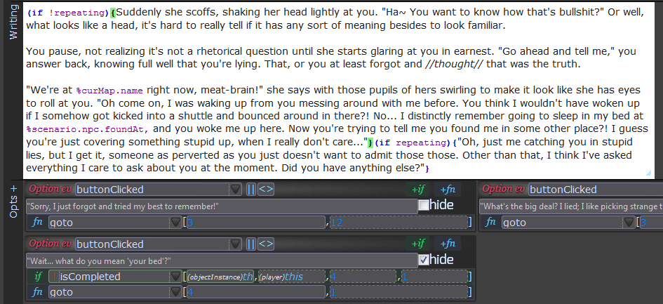
The “Writing” part of the a scene now highlights areas that the parser will use.
The psuedocode parts have different styling, and the brackets for blocks that will either show or be hidden highlight both ends when selected.
String replacements (%objectvariable) are highlighted with their own style as well, and other things like bold and italics markup changes style to give more of an idea of how it’ll look in game.
The layout for the dev tool in general has been changed significantly, as well. (Sized down 1/3rd)
Before:
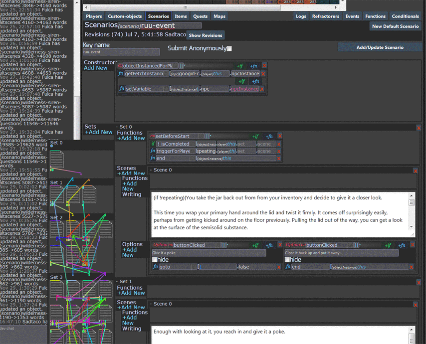
After:
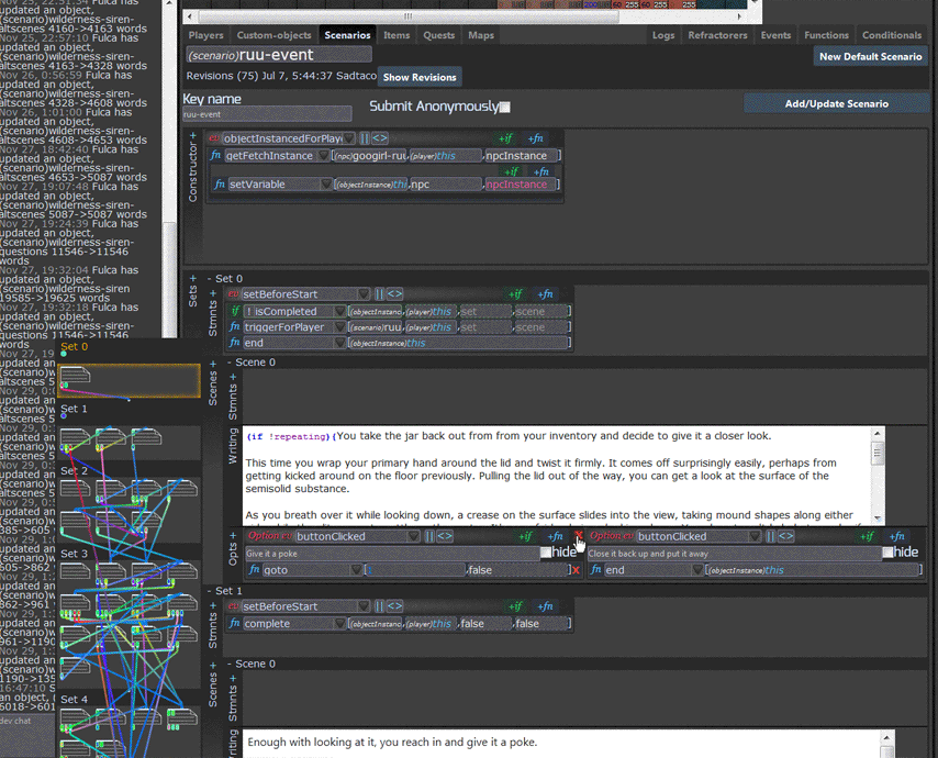
There’s lots of small changes here where I sought to reduce clutter and make some parts more clear. The “close” X’s no longer show unless they are hovered over, instead of there being a ton of X’s all the time. The header things for the different sections are now a thinner vertical header. Before, the scripting inputs were very cramped, especially on low resolutions. A lot of redundant text was removed. The scenario “minimap” on the left is more compact, sticks with scrolling, and has some more usefulness to it.
There is more to add and improve with the tools, but I want to get Alpha3 out before I do that. I’ll be giving out a lot more keys then, and after that release (well, once I have all the issues with the game fixed) will come a public release where you will no longer need keys.
What’s left to do before Alpha3 is released is to implement some sort of caching (this is a major undertaking, and there are a lot of different options to go with on implementing this that I have to decide..), to redo player status effect type items like the Matriach’s eggs to make more sense programmatically, and to redo two pieces of content that have (rightfully) gotten some negative feedback or that is just too unfinished.
A more complete list of changes follows
Game
- Fixed an issue where you could somewhat start the game without confirming age, however it just started the renderer and not other parts so you couldn’t actually play. (I need to redo this to only verify on registration, this is useless at the moment)
Dev tools
- Reduced the time it takes for the dev tool to load by ~2x
- Reduced the time it takes to load a game object within the dev tool by at least 10x. Previously a very very complex game object could take over a minute to load into the dev tool in Firefox, and now the same one takes a few seconds
- Made various styling improvements to the dev tools, for improved clarity and compactness
- Spellcheck no longer happens on some inputs where it shouldn’t
- Directing to a scene goes by an index rather than reference, so previously moving scenes around messed up these index pointers. Now those pointers refactor when scenes are moved around, making editing scenarios much easier. (maybe these should be keys instead of indexes… still need to todo reordering sets)
- The scenes minimap now sticks to the side as it’s scrolled through, and highlights where the page is scrolled to, to make editing complex scenarios easier. (has some bugs with it I still need to fix)
- Fixed an issue where dragging a scene around to reorder them would also trigger the expanding or collapsing of that scene afterward
- Fixed an issue where a scene could not be dragged into another set of scenes
- Fixed an occasional styling issue when expanding a statement to be full width
- Fixed an issue with the scenario box styling being messed up when there is only a little amount of horizontal text but a lot of vertical


